Case study 04 · February 2021 — November 2022
Crediverso
A bilingual bank where family isn't a feature. It's the first thing you tap.
Before I say anything — look at the launch screen.
The First Bank for Latinos
Two buttons you'd expect on any bank.
And a third, smaller one most banks would never ship: someone in your family already has an account, and they brought you in.
That line is the entire thesis, rendered in UI. Family isn't a feature bolted onto a banking app. It's the door — tap it.
Maria invited you. You're a Garcia now — that's who you are for the rest of this page.
The first credit checks in Spanish — then a whole bank
Crediverso was the first US company to offer free credit checks in Spanish. The next move was an all-in-one bilingual bank for the same audience. I joined eight months in — three of us shipping V1 over fourteen months.
The mandate was simple to say, hard to ship: a bilingual banking product for US Hispanic households, a market failed by fragmented, English-only financial tooling. The hard calls were never whether to ship bilingual. They were about which product identity drives a screen's hierarchy when two options are equally defensible.
When SWOTs resolve evenly, the tiebreaker is rarely "best UX." It's "which option reinforces the product's identity."
This is the story of one such call — the V1 nav bar — and the move I keep coming back to.
What the research kept saying
Zoom interviews, web analytics, social listening, competitor teardowns — synthesized into three avatars. Mateo was the gap-test: a user who feels at home in English is the wrong default for this product. Three findings set the V1 direction.
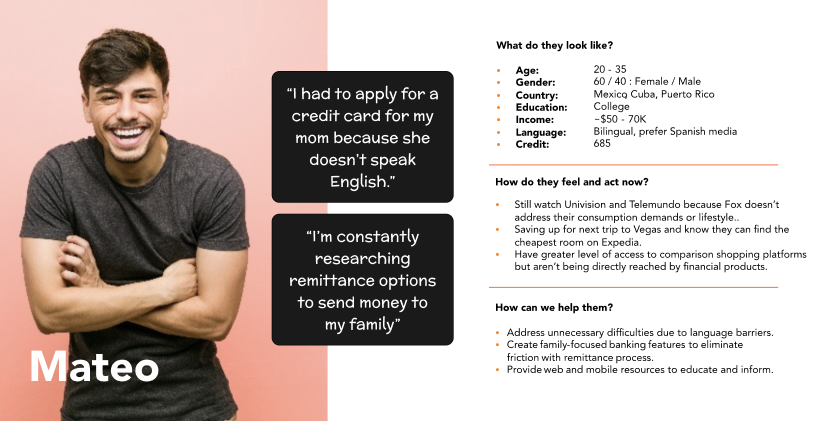
- 0 say sending money home matters. 75% already use remittance services. Remittance is a primary banking job here — not an edge feature.
- 0 Americans are Spanish-dominant. Preference for Spanish rises sharply as financial terminology gets denser. Bilingual is a core requirement, not a translation pass.
- 0 ask relatives to research purchases for them. Financial decisions in this market are family-coordinated, not individual. That reframes the whole product — hold onto this one; it's the finding that breaks the tie later.
Bilingual isn't a translation layer
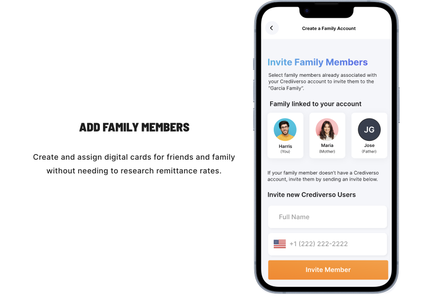
Maria — the cousin who invited you in — reads in Spanish. So the layout was built for her string first, not English's. The information hierarchy of every screen has to breathe for the longer language. You can read that decision, or watch it happen on her card.
Send money to the people who count on you.
The information hierarchy has to breathe for the longer language.
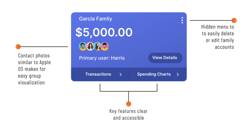
Family as a primitive, not a footnote
Family Cards turned household structure into a product object. Each member gets a card. Funds move between cards. The primary user sees their account and the family group at the same altitude — because that's how a Hispanic household reads 'this is mine, that is ours.'
The decision the matrix couldn't make
Split (a dedicated Family tab) or Combined (one Accounts surface, family on the home screen). Both defensible. Both got real SWOTs. You're the Garcia who needs to send a cousin $200 — look at each, then ship the one you'd ship.
Two defensible navs for the Garcia household — you're sending a cousin $200. View each, then ship one.
- Open app · 1
- Tap Family tab · 2
- Tap Garcia Family · 3
- Tap Move money · 4
- Tap cousin · 5
- Enter $200 · 6
- Confirm · 7
Juan's Account
$3,450.76 ····1234
- Netflix sub−$12.01
- Macy's−$32.99
- Amazon−$18.07
- ACH payment+$1,200.07
family lives one tab away →
- Single-user clarity on the home screen
- Family feature visible in all UI previews
- Easy to implement page-specific features
- Lacks a dedicated Move-money page
- 25% of menu nav irrelevant for single-user
- Primary accounts compete for clarity
- Family page → primary onboarding for new household members
- Buries the family thesis behind a tab
Hi, Juan.
$3,450.76 ····1234
- Netflix sub−$12.01
- ACH payment+$1,200.07
Family
- Accounts is all-inclusive
- Family accounts visible on the same page as primary
- Lots of info on the home page
- Higher screen density
- Move-money becomes its own action surface
- Develops an intuitive UI muscle other partner products inherit
- Requires careful UI lift to avoid feeling cluttered
The matrix ran even and the tap-count favors Combined — but that's not the whole story. Look at both options, then you make the call.
You've seen both. You're the Garcia sending a cousin $200 — which nav would you ship?
You shipped Combined — the call I made too. And not because it saved two taps.
You shipped Split — genuinely cleaner for one user, and the tap-count is on your side. I made the other call; here's the trade you took.
Both SWOTs are defensible. Split is genuinely cleaner for a single user. But splitting the household behind a tab buries the family thesis the whole product is built on — the family you were just invited into. The tiebreaker isn't the matrix and it isn't the tap-count — it's the identity: family-first. That's why Combined shipped, with Move Money as its own dedicated action surface inside the combined home.
The obvious answer is fewer taps — ship Combined, move on. But the tap-count was a trap: optimizing for it would have buried the exact household you were just invited into. When both options are defensible, I trust the thesis over the heuristic.
The pattern carries. Should a third-party flow open inline or in a sheet? If the matrix runs even, the question becomes which choice reads more like Crediverso. Identity becomes load-bearing.
What shipped
V1 launched on iOS in November 2022 with full bilingual coverage across every flow. Onboarding and credit card surfaces were mine end-to-end. Family Cards, Move Money, and the Accounts home came out of the system team.
The 50-participant round validated the primary flows. A/B-tested launch messaging grew the channel 125% before the App Store hit. The Figma primitives built around the multi-product structure carried the next partner product into design with no redesign.
The door you walked through
You were invited by Maria. You looked at both navs, and you shipped one.
That's the whole product in one decision: a household kept visible from the front door, in the language the family actually reads. The thesis wasn't a slogan over the work — it was the tiebreaker inside it, and you just used it.
When the UX answer is "both," the only honest tiebreaker is "which one reads more like the product we said we'd build."
Credit to my Crediverso collaborators on design, product, engineering, and marketing — and to the Garcia family of avatars (Juan, Mateo, Maria) who anchored every sprint.